Need help in using our WordPress theme?
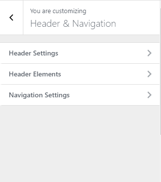
The Header & Navigation is where you set the behavior of the header and how it looks.
The header settings is divided into 3 parts:
|
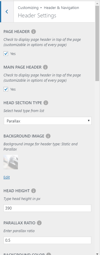
Header Settings
PAGE HEADER - Option to display page header on top of the page. (Customizable in options of every page)
MAIN PAGE HEADER - Appears when Page Header is Yes.
HEAD SECTION TYPE - Choose which type of head section you want to display (works only when header is enabled).
BACKGROUND IMAGE - Default background image of the header.
HEAD HEIGHT - Height in pixels of the header.
PARALLAX RATIO - Speed of the parallax of the header if header type is parallax.
BACKGROUND COLOR - Background color of the header.
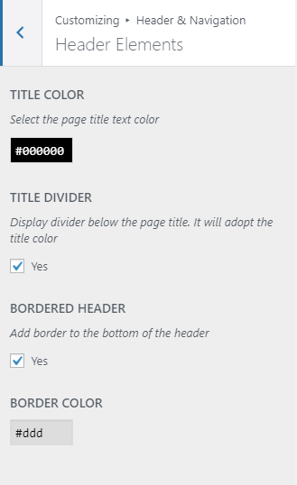
Header Elements
TITLE COLOR - Text color of the header text.
TITLE DIVIDER - Option to add a divider.
BORDERED HEADER - Option to add a border for the header title.
BORDER COLOR - Color of the header title if border header is Yes.
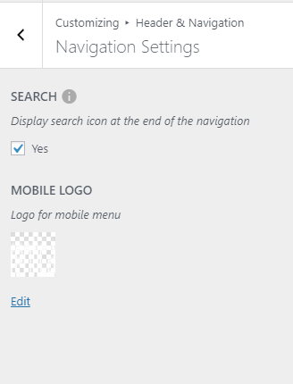
Navigation Settings
SEARCH - Option to add a search icon at the header navigation.
MOBILE LOGO - Logo for the mobile menu in mobile view.
Add all the information you like to add, then click on the Save button.