Need help in using our WordPress theme?
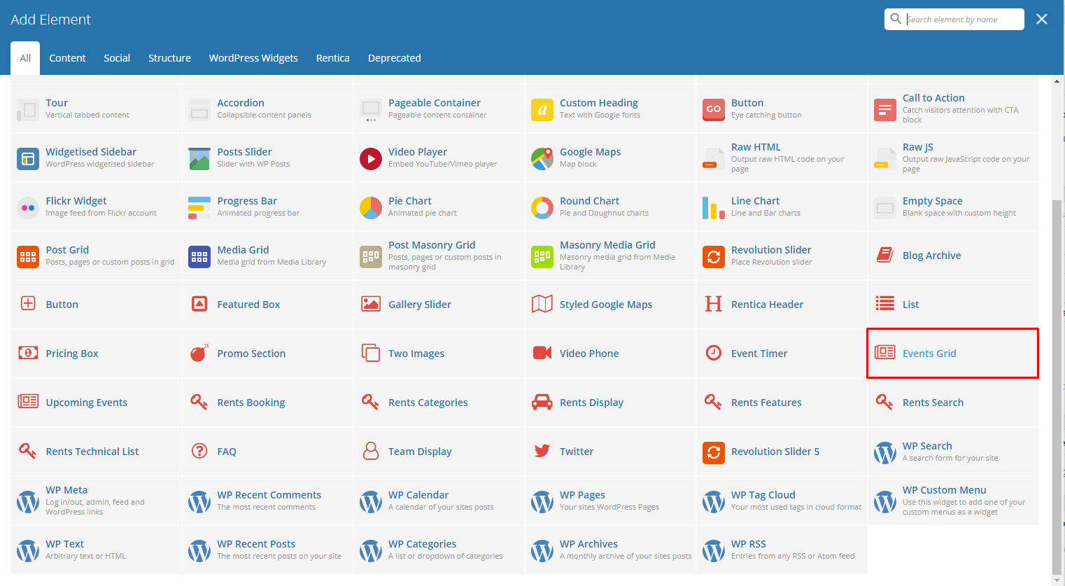
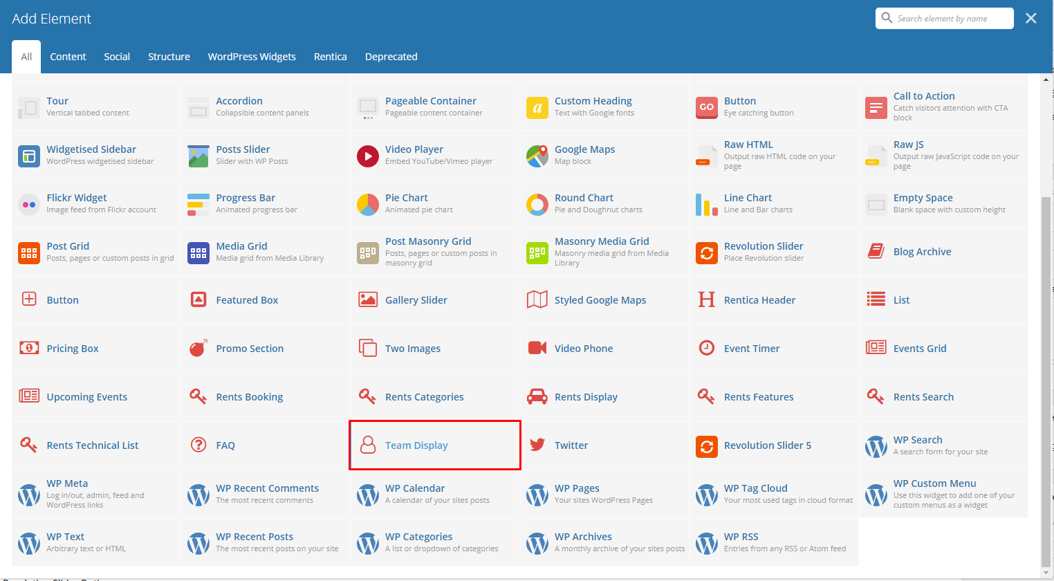
With Rentica comes many custom shortcodes for (Visual Composer) VC that are used to show content created in Rentica.
Below you will find short information about this Visual Composer elements:
|
|
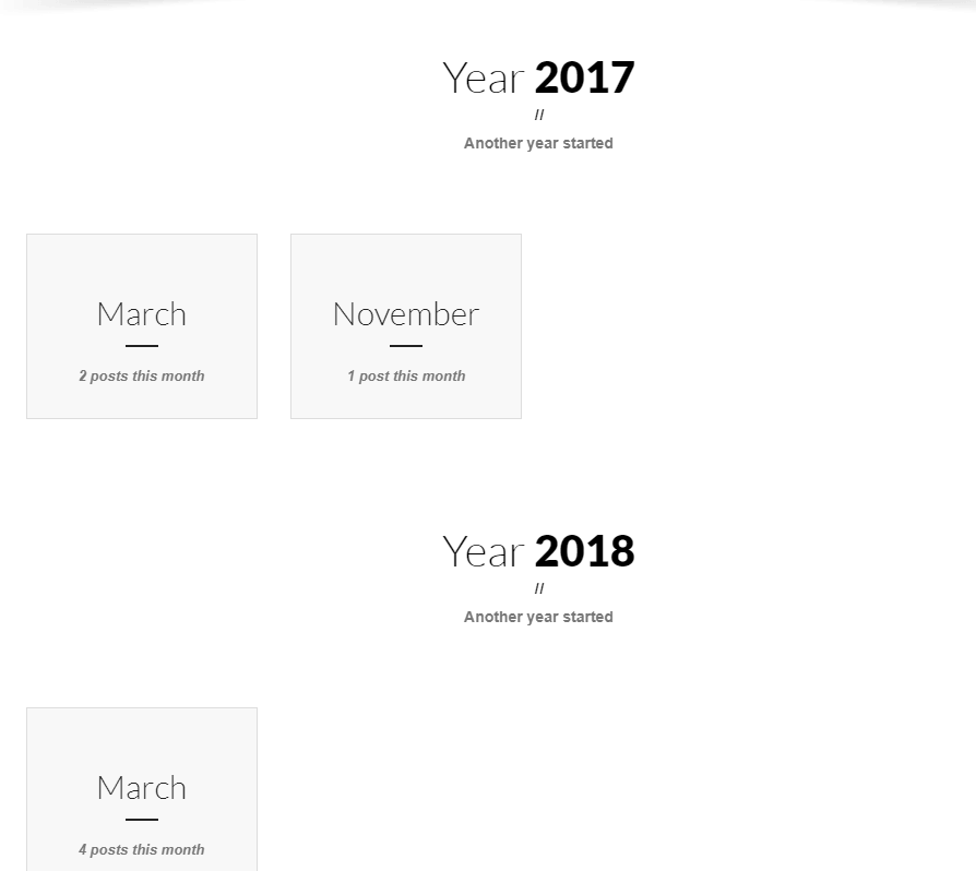
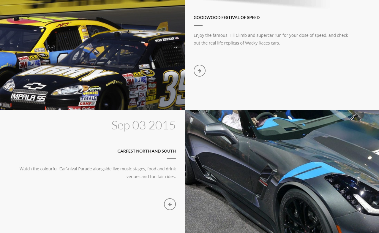
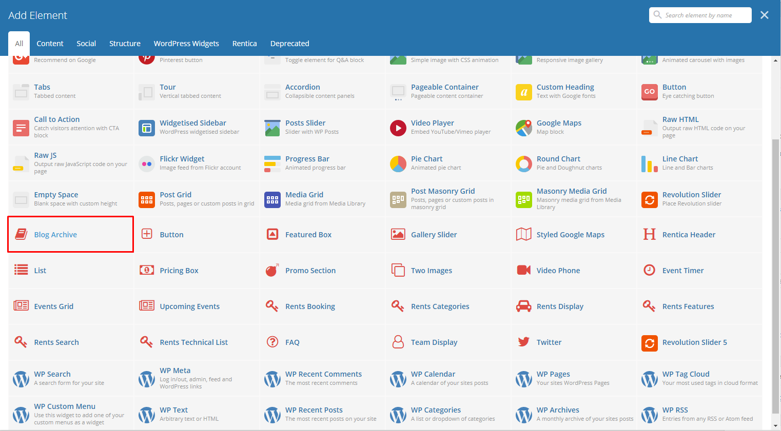
This will let you add blogs that is archived/grouped.
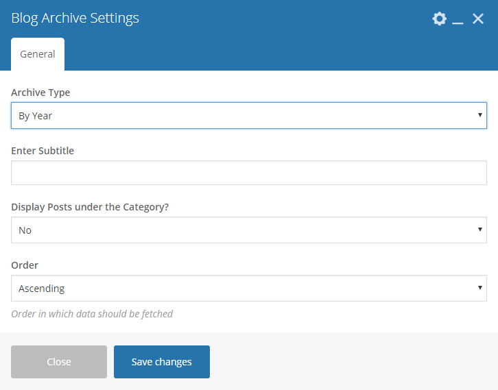
|
-General Tab-
Archive Type - How the blogs are archived/grouped.
By Year
- Enter Subtitle - Subtitle written below the year/category.
- Display Posts under the Category - Display number of posts.
- Order - Order in which data should be fetched.
By Categories
- Display Posts under the Category - Display number of posts.
- Order - Order in which data should be fetched.
- Specify Event Categories - Specify a category that you want to show.
- Exclude Categories - Specify a category to exclude.
Sample Blog Archive:
|
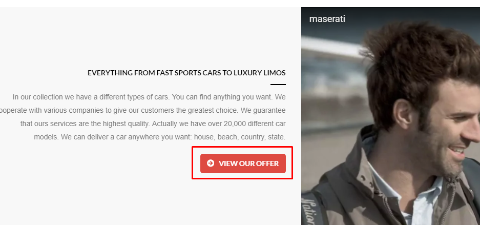
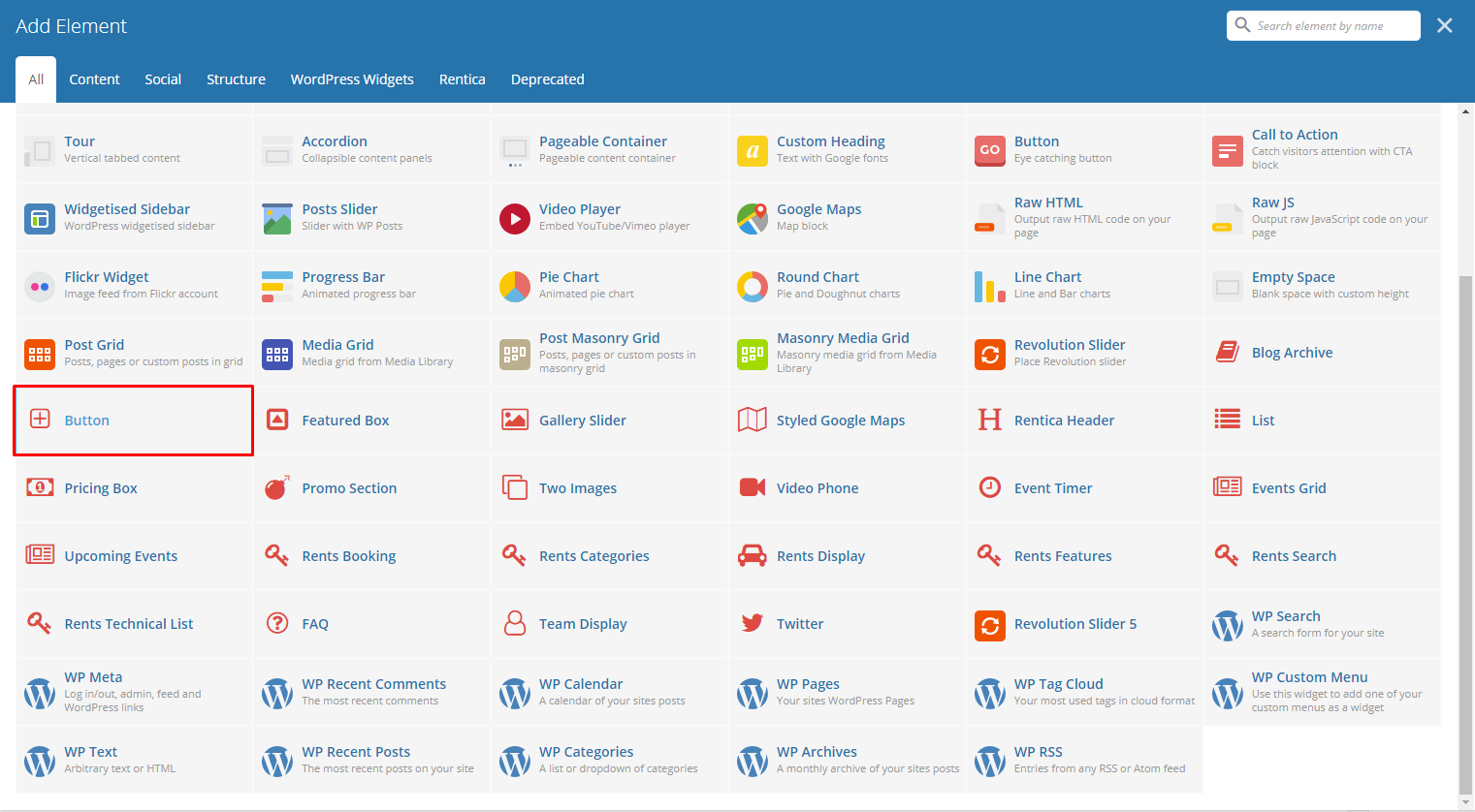
This theme comes with VC element that give you the option to create buttons that can be used in the theme.
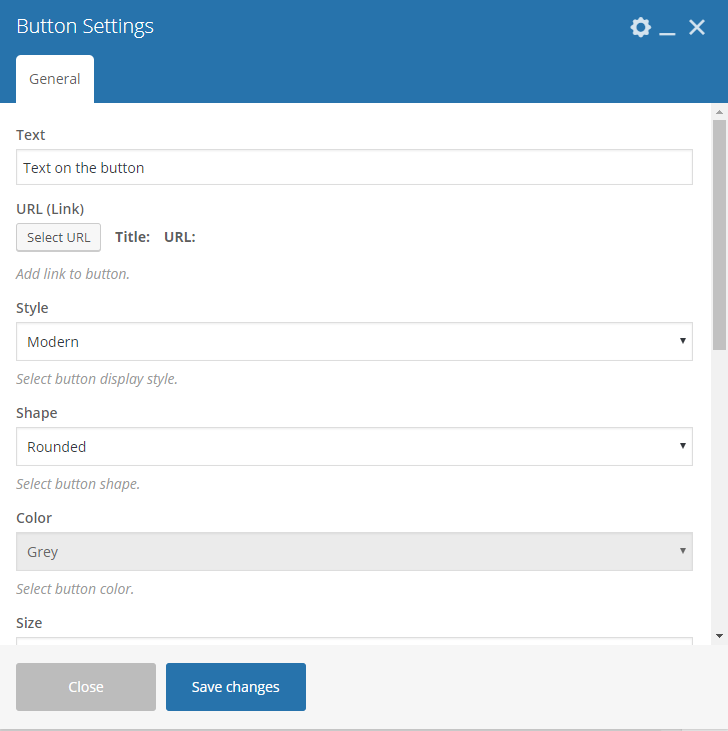
|
-General Tab-
- Text - The label of the button.
- URL (Link) - URL link for the button.
- Style - Display style of the button.
- Shape - Shape of the button.
- Color - Background color of the button.
- Size - Size of the button.
- Alignment - Alignment of the button.
- Add Icon? - Option to add an icon in the button.
- CSS Animation - If Add icon is Yes, this option will show. Add the icon you would like to use.
- Element ID - A unique ID for the button.
- Extra class name - You can add a Custom CSS variable that is made in the Customizer > Additional CSS, click here for details.
- Advance on click action - Option to be add a javascript action.
Sample Button:
|
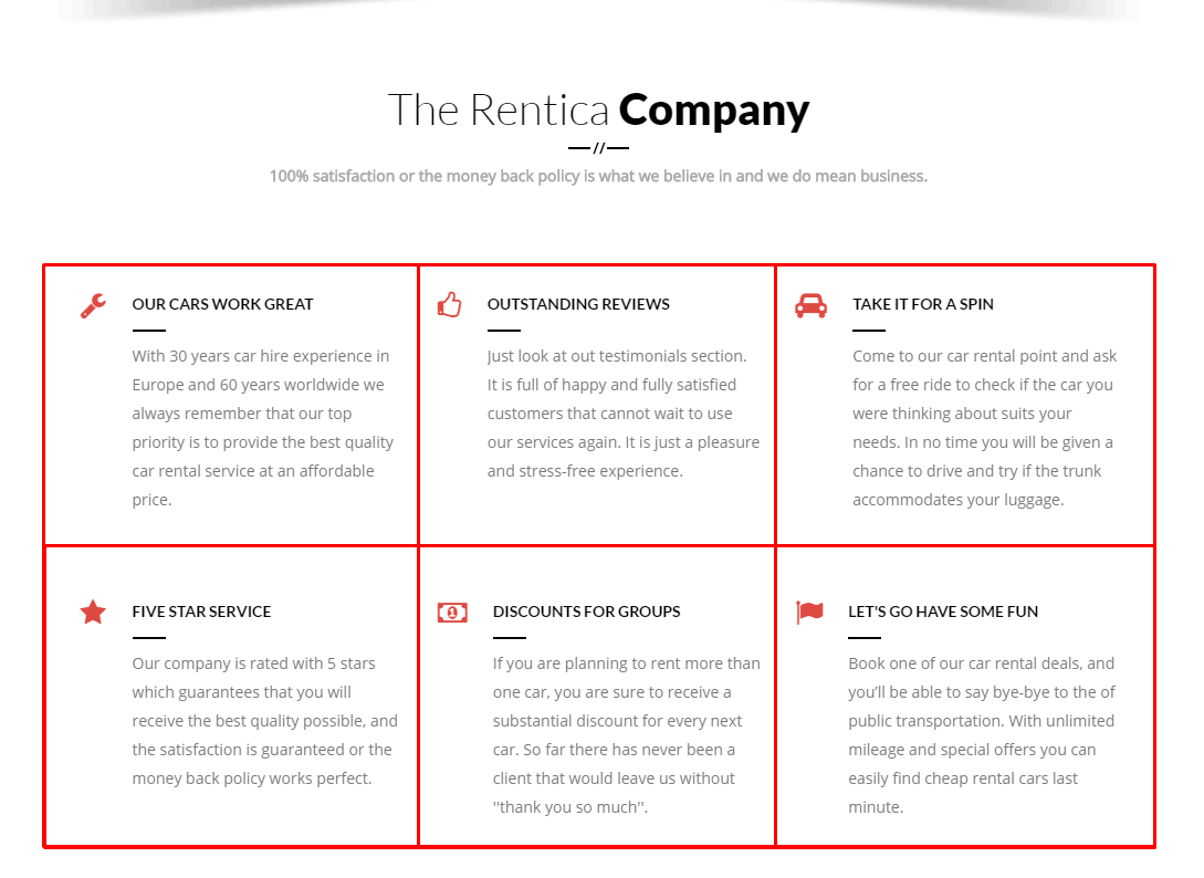
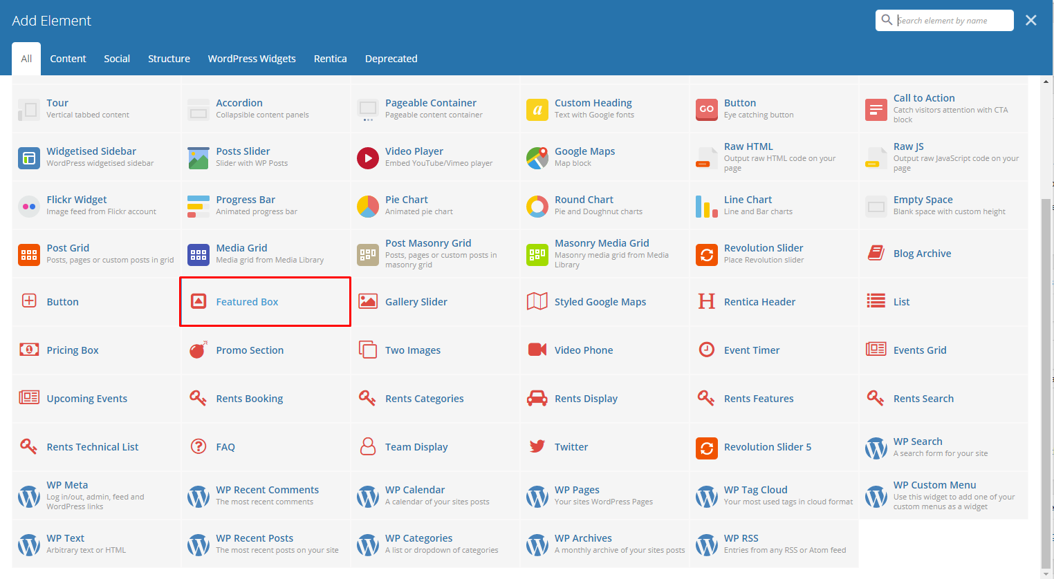
This will let you create a feature box with icon or number counter.
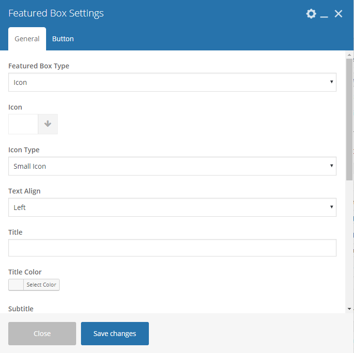
|
-General Tab-
Featured Box Type - Type of featured box you would like to show: Icon or Number Counter
Icon - Select an icon to use.
Icon Type - How the icon would look and behave.
Text Align - Alignment of the text.
Title - Title of the featured box.
Title Color - Font color of the title.
Subtitle - Text below the title.
Subtitle Color - Font color of the subtitle.
Bigger Subtitle Size - Option to have the subtitle size bigger than the title.
Add Button - Option to add/enable the button.
Add Email - Option to add email.
Add Social Icons - Option to add social icons.
Note
The social icons that will show are the ones that are set in Customizer > Footer > Sub Footer
-Button Tab-
- Text - The label of the button.
- URL (Link) - URL link for the button.
- Style - Display style of the button.
- Shape - Shape of the button.
- Color - Background color of the button.
- Size - Size of the button.
- Alignment - Alignment of the button.
- Add Icon? - Option to add an icon in the button.
- CSS Animation - If Add icon is Yes, this option will show. Add the icon you would like to use.
- Element ID - A unique ID for the button.
- Extra class name - You can add a Custom CSS variable that is made in the Customizer > Additional CSS, click here for details.
- Advance on click action - Option to be add a javascript action.
Sample Featured Box:
|
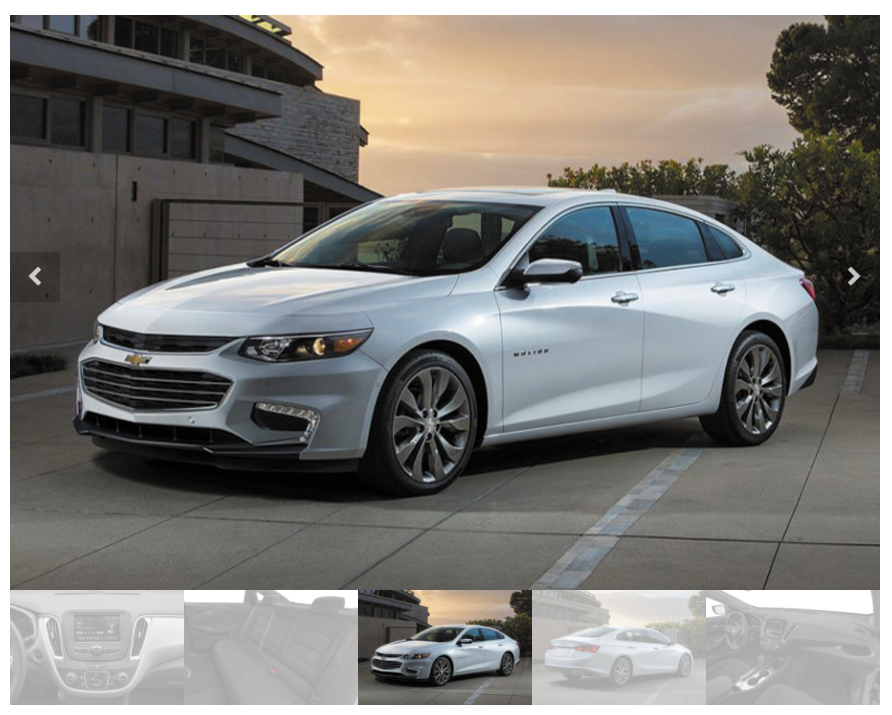
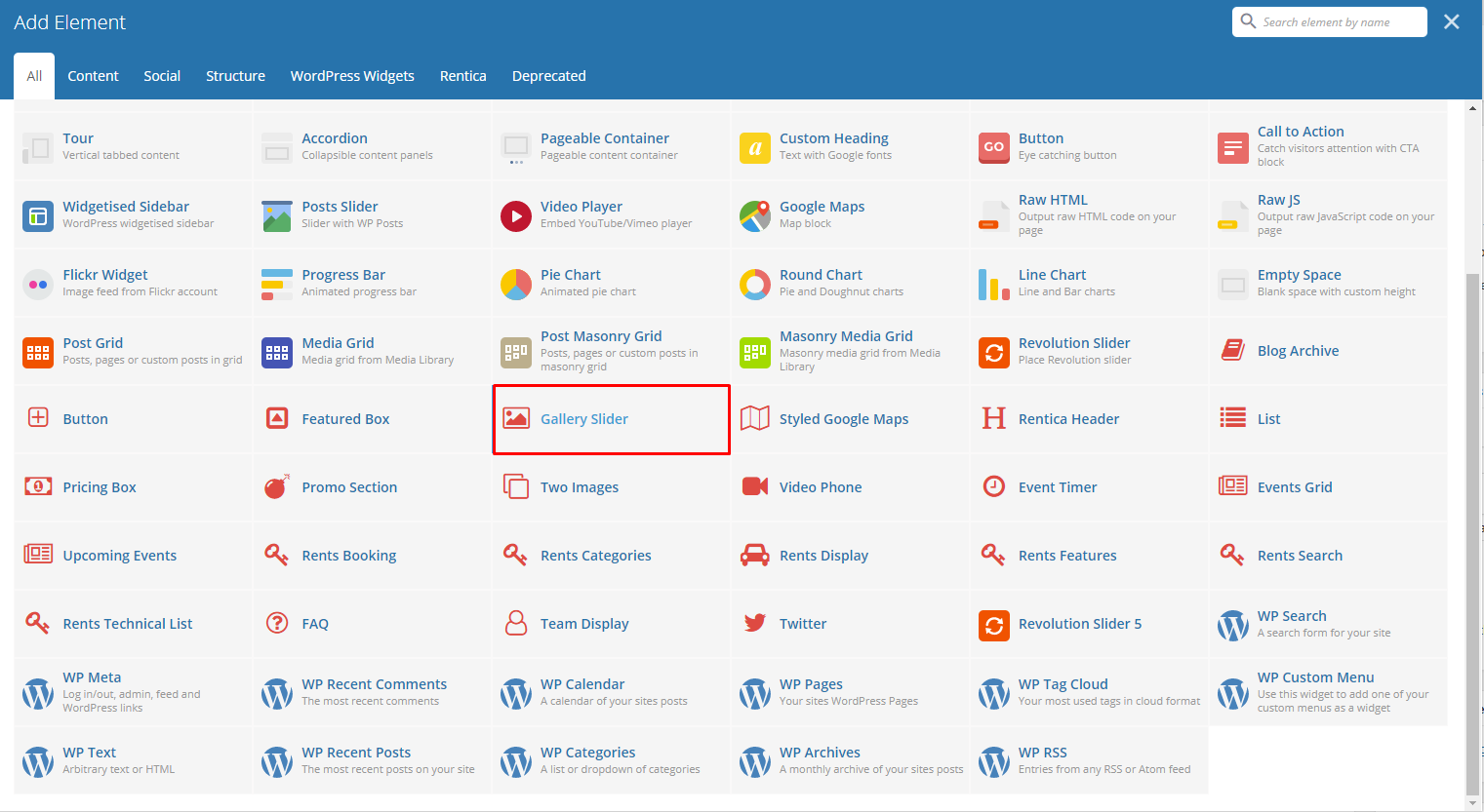
This will let you create a gallery of images slider.
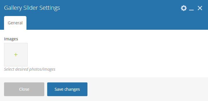
|
-General Tab-
- Images - Select images you want to use.
Sample Gallery Slider:
|
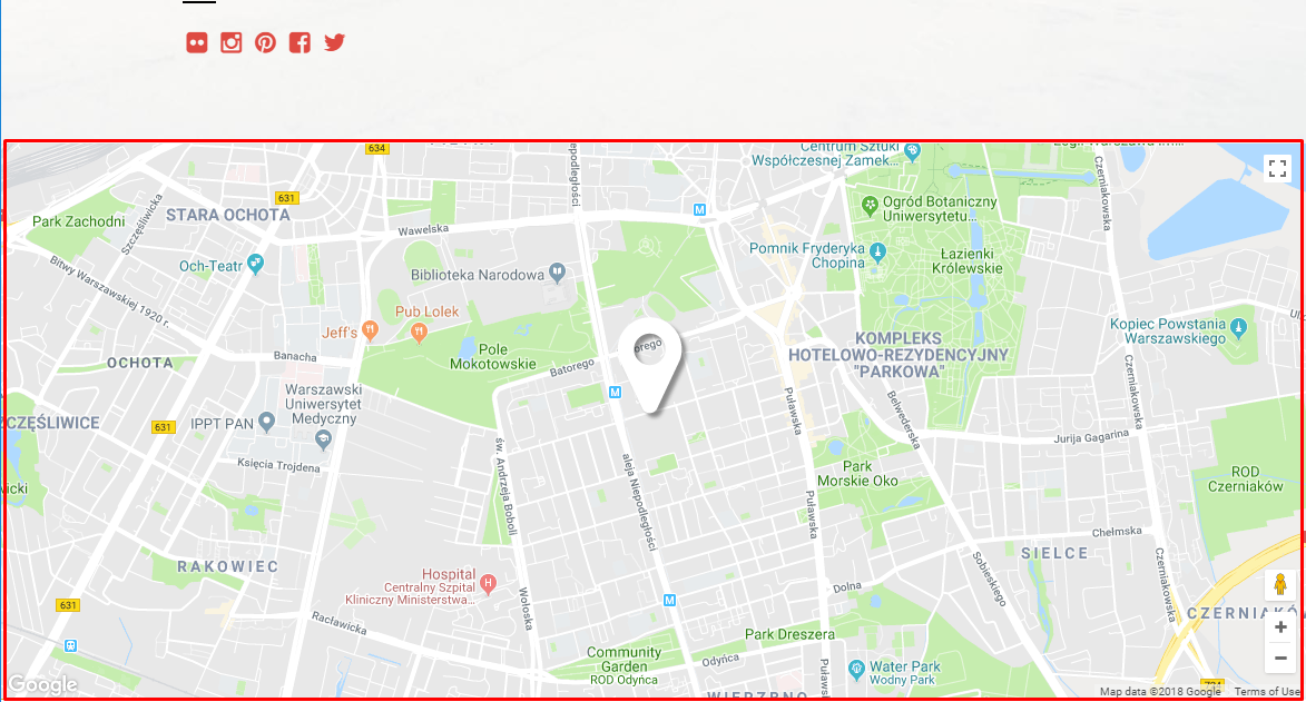
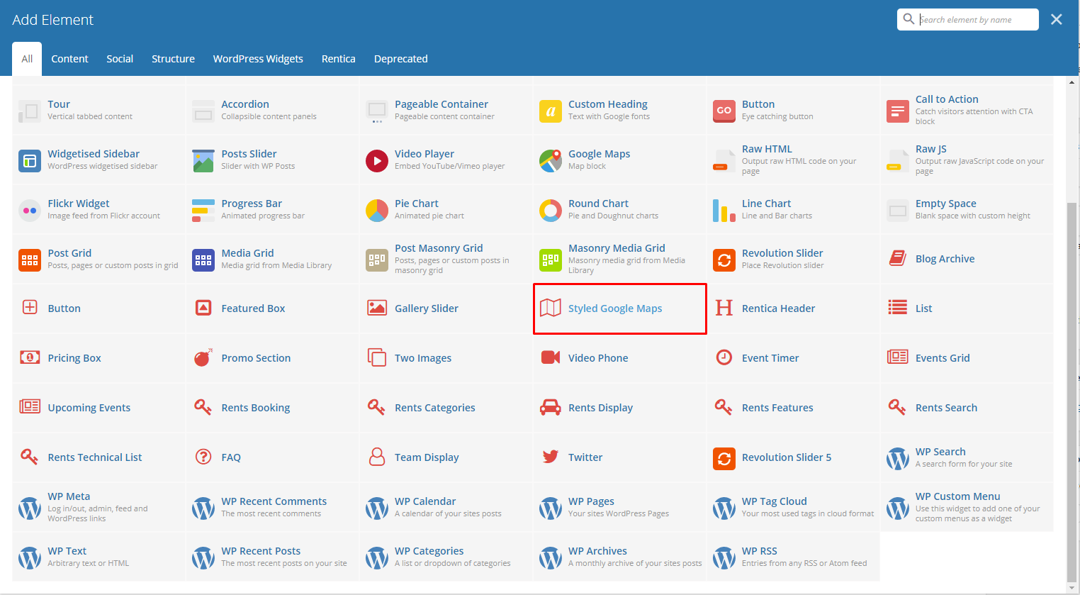
Lets you add a styled google map on a page. You will be able to customize this map in the Styled Google Maps Settings.
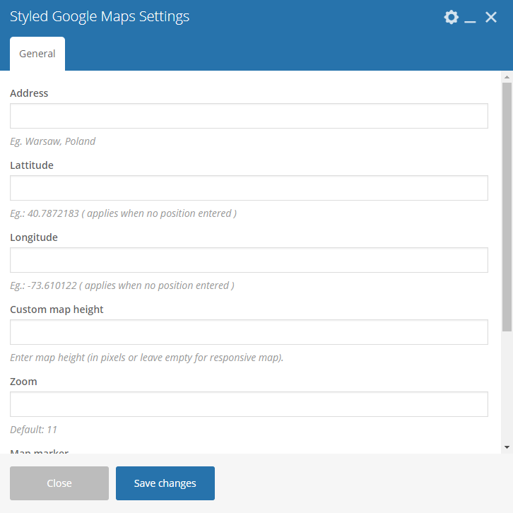
|
-General Tab-
- Address - Set an address for the map.
- Latitude - Option to add a latitude of the address.
- Longitude - Option to add a longitude of the address.
- Custom map height - Height of the map.
- Zoom - Zoom percentage of the map.
- Map marker - Option to add a custom map marker.
- Map style code - Paste “JavaScript Style Array” here, you can find and create it on: snazzymaps.com
Sample Styled Google Maps:
|
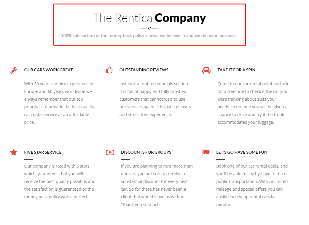
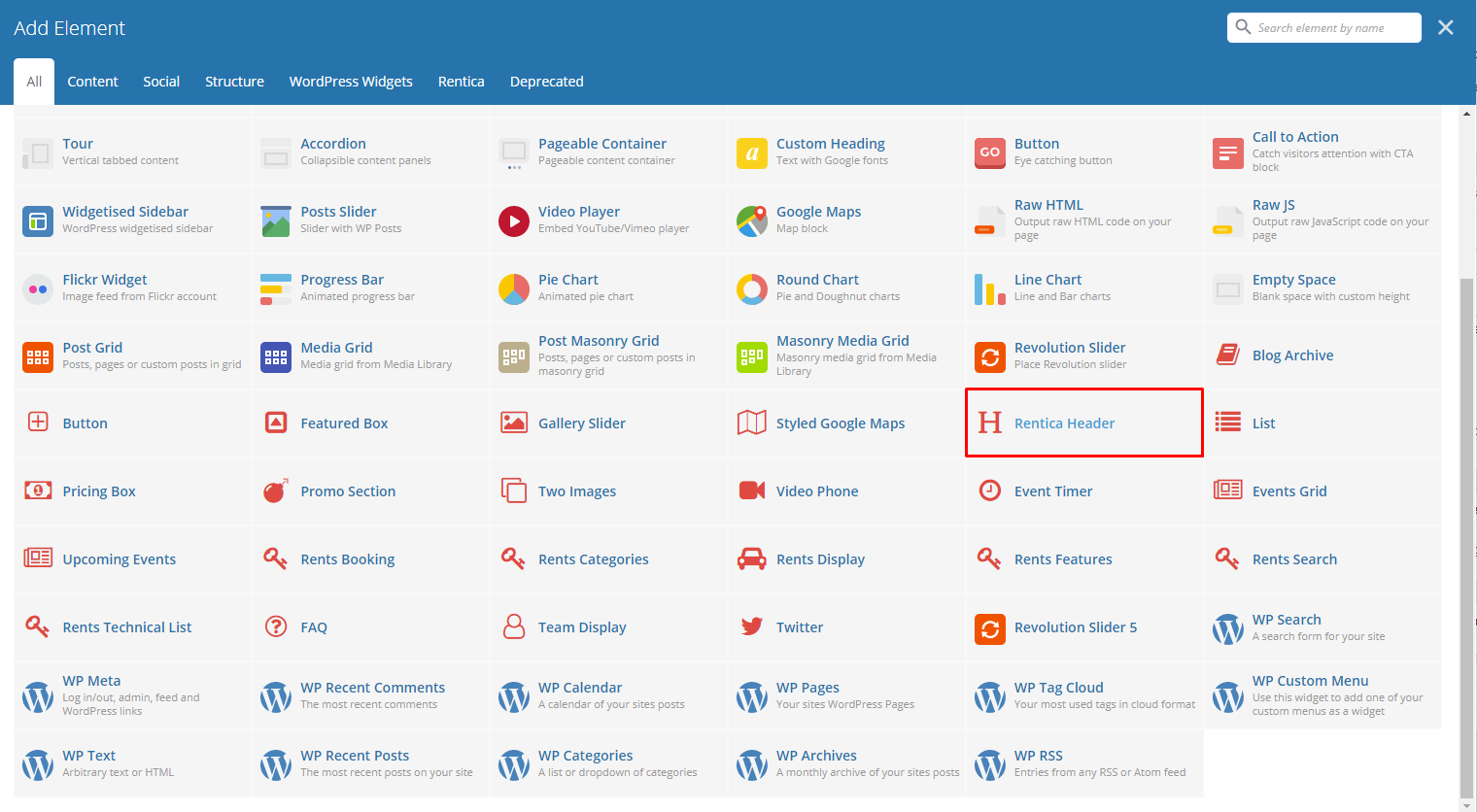
Lets you add a styled header on a page. You will be able to customize this header in the Styled Header Settings.
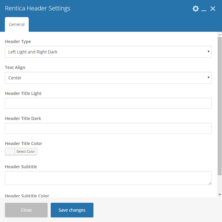
|
-General Tab-
- Header type - Set what type of header you want to use.
- Text Align - Text alignment of the header.
- Header Title Light - Text in the part of the header title that has a light color.
- Header Title Dark - Text in the part of the header title that has a dark color..
- Header Title Color - Header title’s main font color.
- Header subtitle - The subtitle that will be shown in the header.
- Header subtitle color - Header subtitle’s font color.
Sample Rentica Header:
|
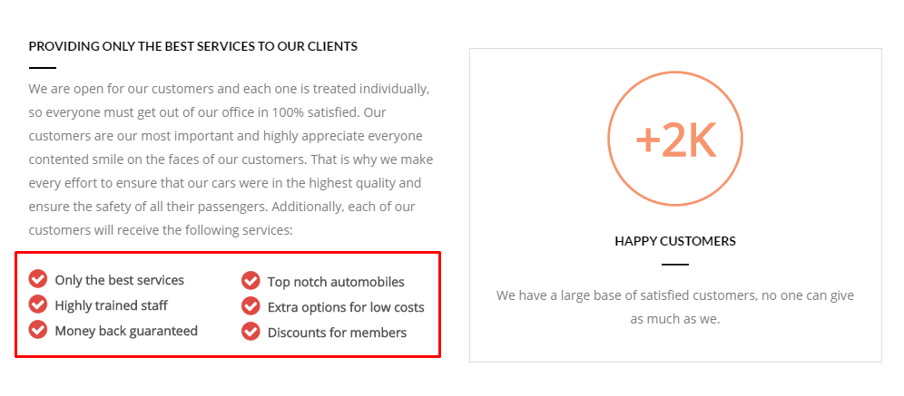
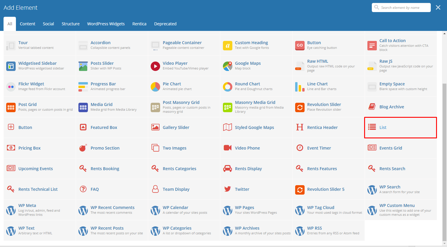
This theme element will let you add list with an icon bullet.
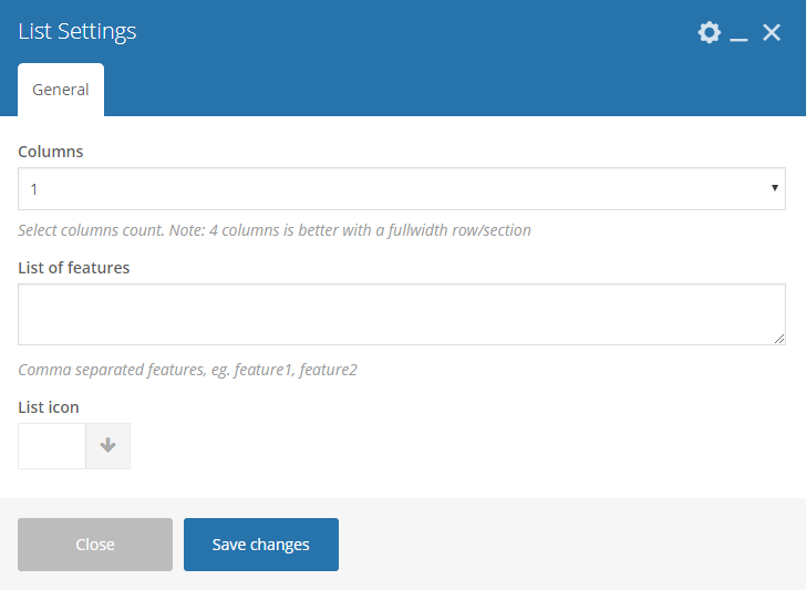
|
-General Tab-
- Columns - Number of columns to divide the features.
- List of features - Features added to the list. Use a comma (,) to separate the features.
- List icon - icon used as the bullet.
Sample List:
|
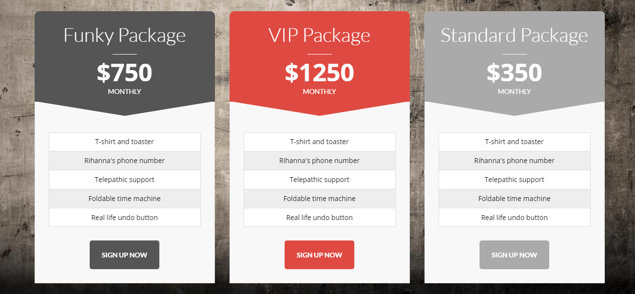
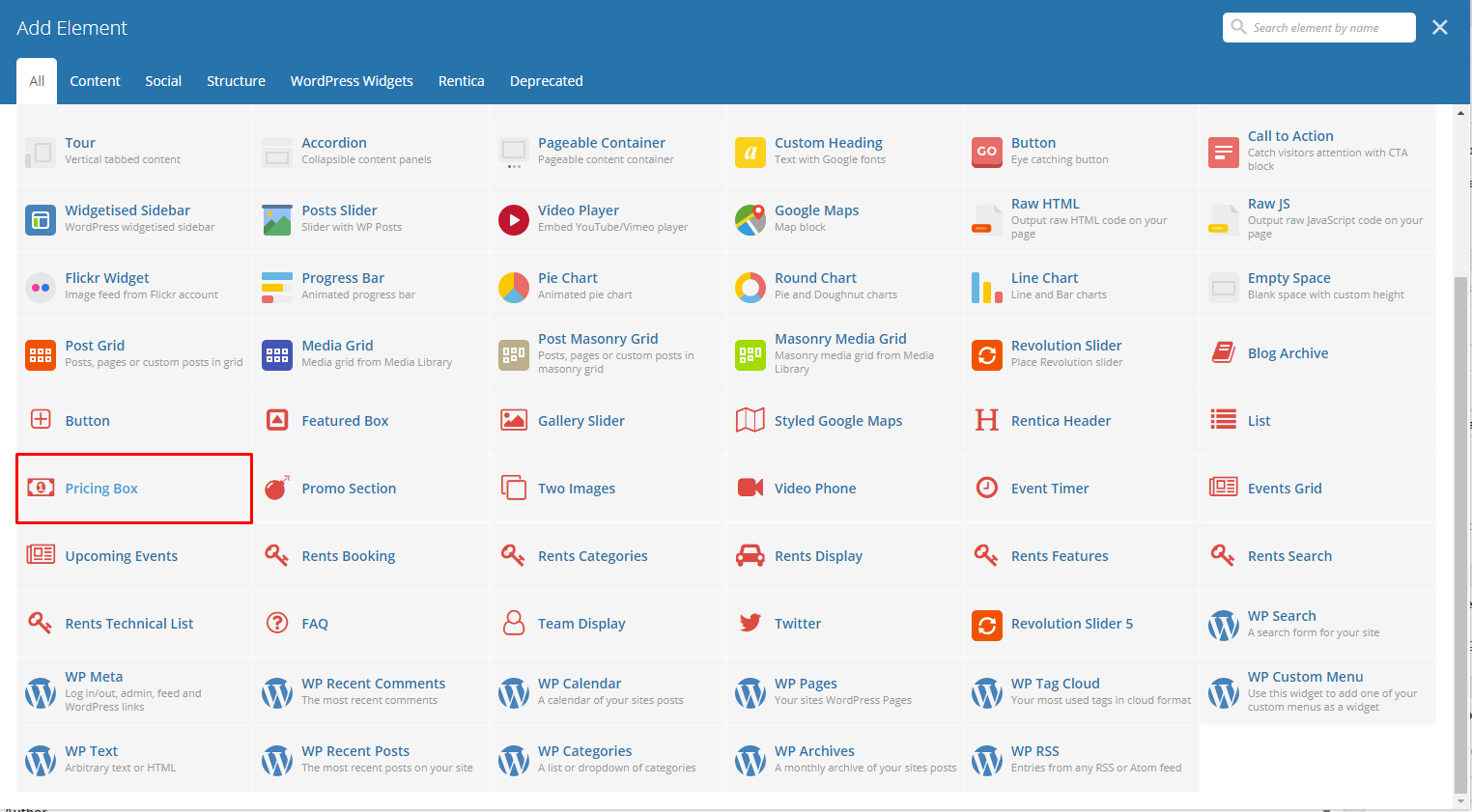
This theme element will let you add pricing box with details about the product.
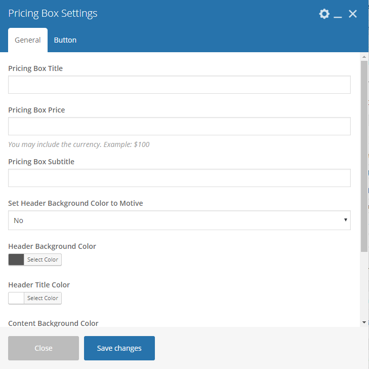
|
-General Tab-
- Pricing Box Title - Title for the pricing box.
- Pricing Box Price - Price for the pricing box item.
- Pricing Box Subtitle - Text below the title.
- Set Header Background Color to Motive - Option to set header background color.
- Header Background Color - Background color for the pricing box header.
- Header Title Color - Font color of the title.
- Content Background Color - Content background color for the pricing box header.
- List of Item - Features added to the list. Use a comma (,) to separate the features.
-Button Tab-
- Text - The label of the button.
- URL (Link) - URL link for the button.
- Style - Display style of the button.
- Shape - Shape of the button.
- Color - Background color of the button.
- Size - Size of the button.
- Alignment - Alignment of the button.
- Add Icon? - Option to add an icon in the button.
- CSS Animation - If Add icon is Yes, this option will show. Add the icon you would like to use.
- Element ID - A unique ID for the button.
- Extra class name - You can add a Custom CSS variable that is made in the Customizer > Additional CSS, click here for details.
- Advance on click action - Option to be add a javascript action.
Sample Pricing Box:
|
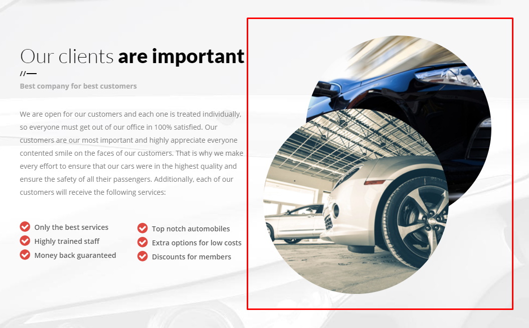
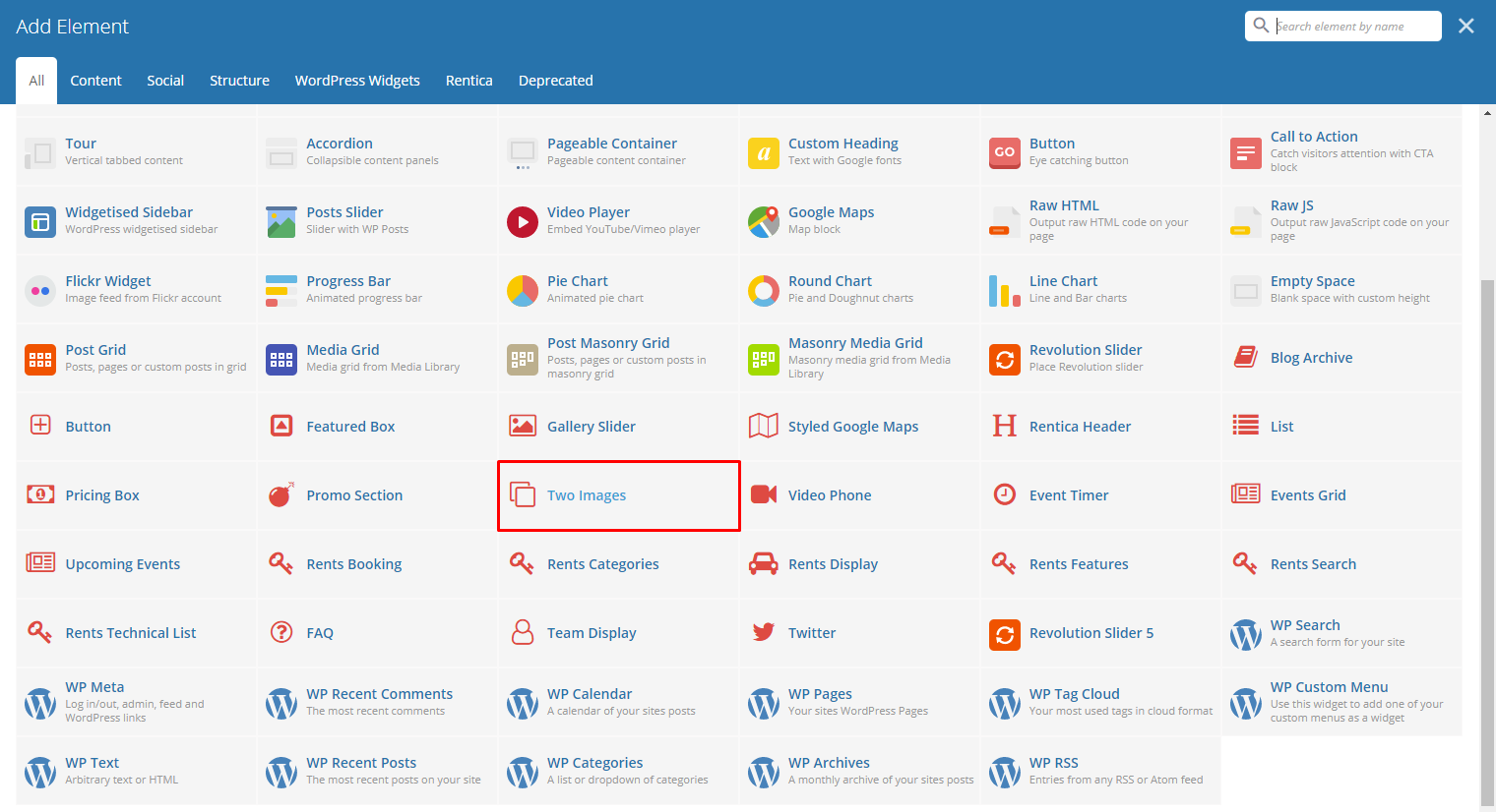
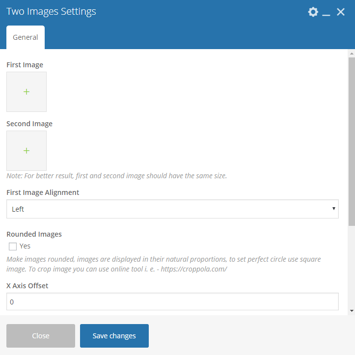
Add two images in the same space with an option to move the second image using its X and Y axis.
|
-General Tab-
- First Image - Set the first image.
- Second Image - Set the second image.
- First Image Alignment - Where the first image is aligned.
- Rounded Images - Option to have a round image.
- X axis offset - Horizontal offset of the second image from the first image.
- Y axis offset - Vertical offset of the second image from the first image.
- Set Image Width - If you set X Axis Offset not exceeding the column width and/or you want to make the two images width the same, you may set image width in pixels.
Sample Two Images:
|
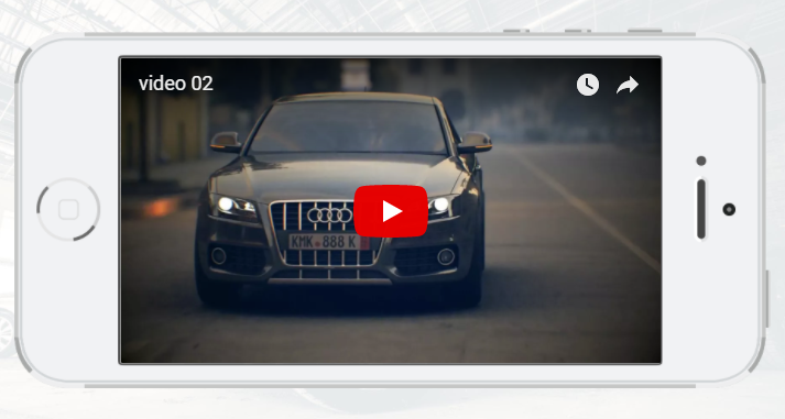
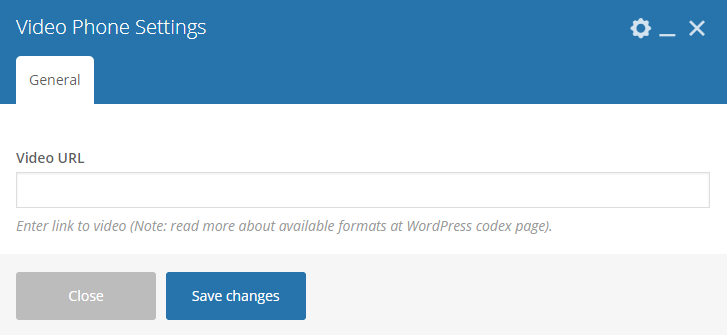
Lets you display a smart phone that has a video playing.
|
-General Tab-
- Video URL - URL of the video you want to show.
Sample Video Phone:
|
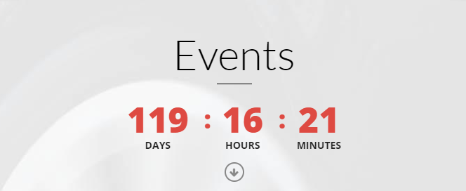
Lets you display events as a carousel. You can filter the events that will show inside the carousel.
|
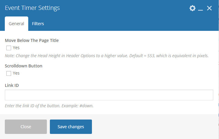
-General Tab-
Move Below The Page Title - Option to display the timer below the page title.
Note
Change the Head Height in Header Options to a higher value. Default = 553, which is equivalent in pixels.
Scrolldown Button - Option to display a scroll down button.
Link ID - URL link for the scroll down button.
-Filters Tab-
- Event - What event you want to use for the timer.
Sample Events Timer:
|
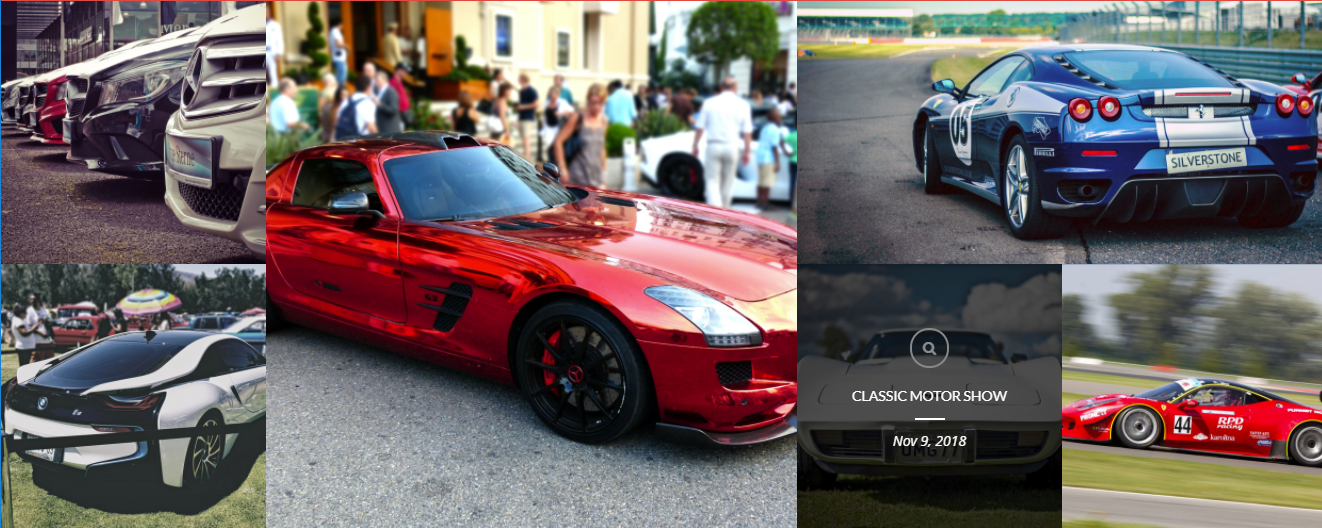
Lets you display events by grid. You can filter the events that will show inside the grid.
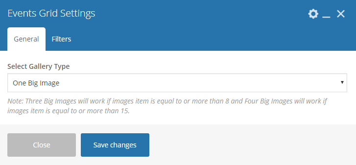
|
-General Tab-
- Select Gallery Type - Add/Change the margin, border, or padding of the promo section.
-Filters Tab-
- Limit - Set results limit.
- Skip X elements - Skip a number of elements from the results.
- Order - How the posts order looks.
- Order by - How the posts are ordered.
- Specify Events - Only selected posts are shown.
- Exclude Events - None of the selected posts will be displayed.
- Specify Event Categories - Only show posts under the categories.
- Exclude Event Categories - None of the posts under the categories are shown.
- Specify post tags - Only show posts with selected tags.
- Keyword search - Show items with certain keyword.
Sample Events Grid:

|
Below you will see all the available options that can/need to be set to use Upcoming Event element.
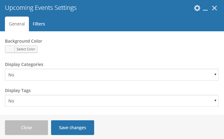
|
-General Tab-
- Background Color - Set the background color for the grid.
- Display Categories - Option to display the categories of the events.
- Display Tags - Option to display the tags of the events.
-Filters Tab-
- Limit - Set results limit.
- Skip X elements - Skip a number of elements from the results.
- Order - How the posts order looks.
- Order by - How the posts are ordered.
- Specify Events - Only selected posts are shown.
- Exclude Events - None of the selected posts will be displayed.
- Specify Event Categories - Only show posts under the categories.
- Exclude Event Categories - None of the posts under the categories are shown.
- Specify post tags - Only show posts with selected tags.
- Keyword search - Show items with certain keyword.
Sample Upcoming Events:
|
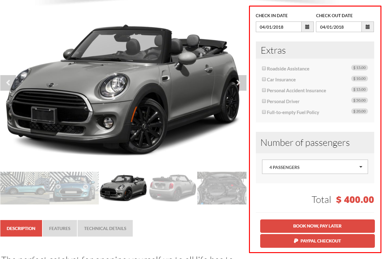
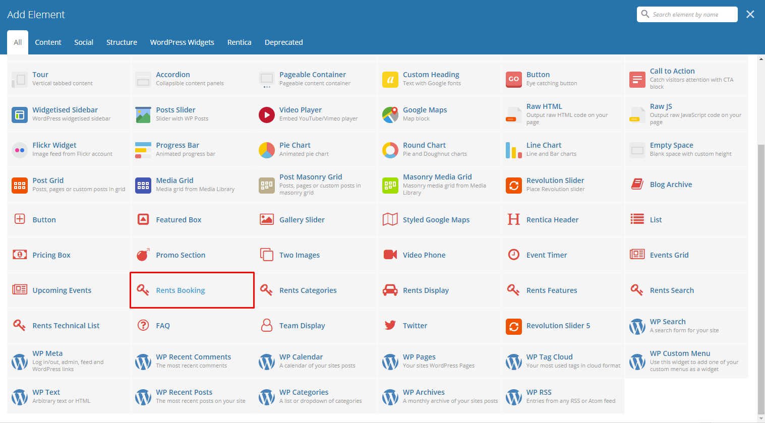
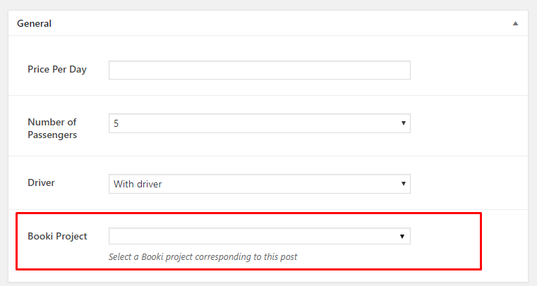
This element is used in Rents post type and it lets you add a Booki booking form. You set the Booki Project in the Rents form under General > Booki Project. For more information, click here.
Note
If the Booki Project is not set, the area with the Rent Booking will be left blank.
Sample Rent Booking:
|
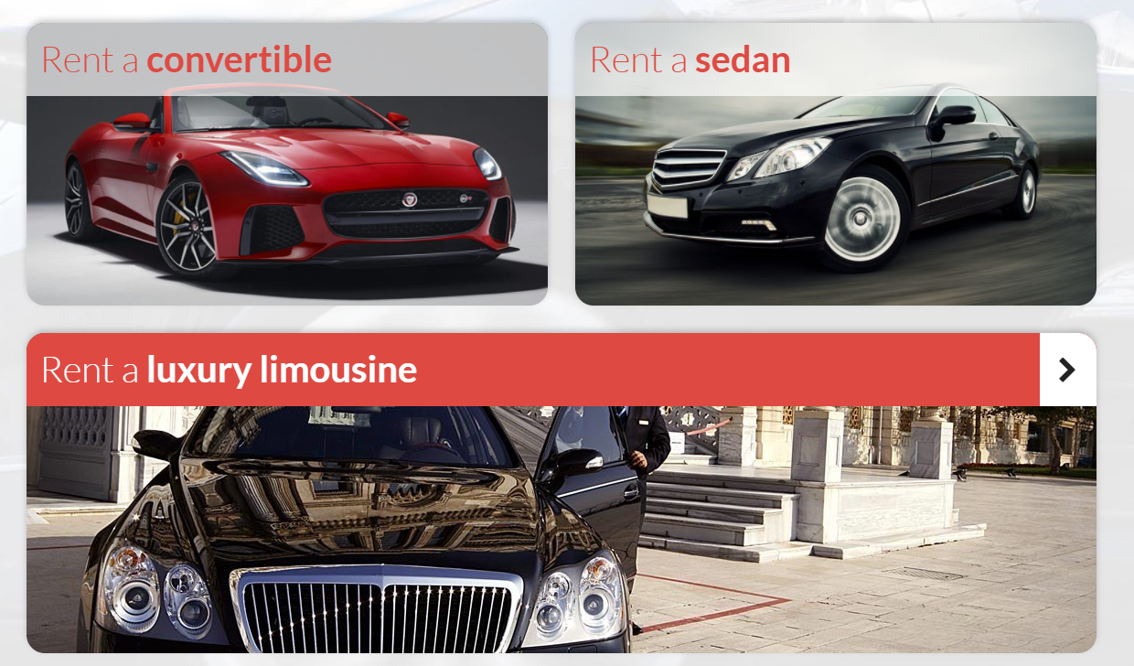
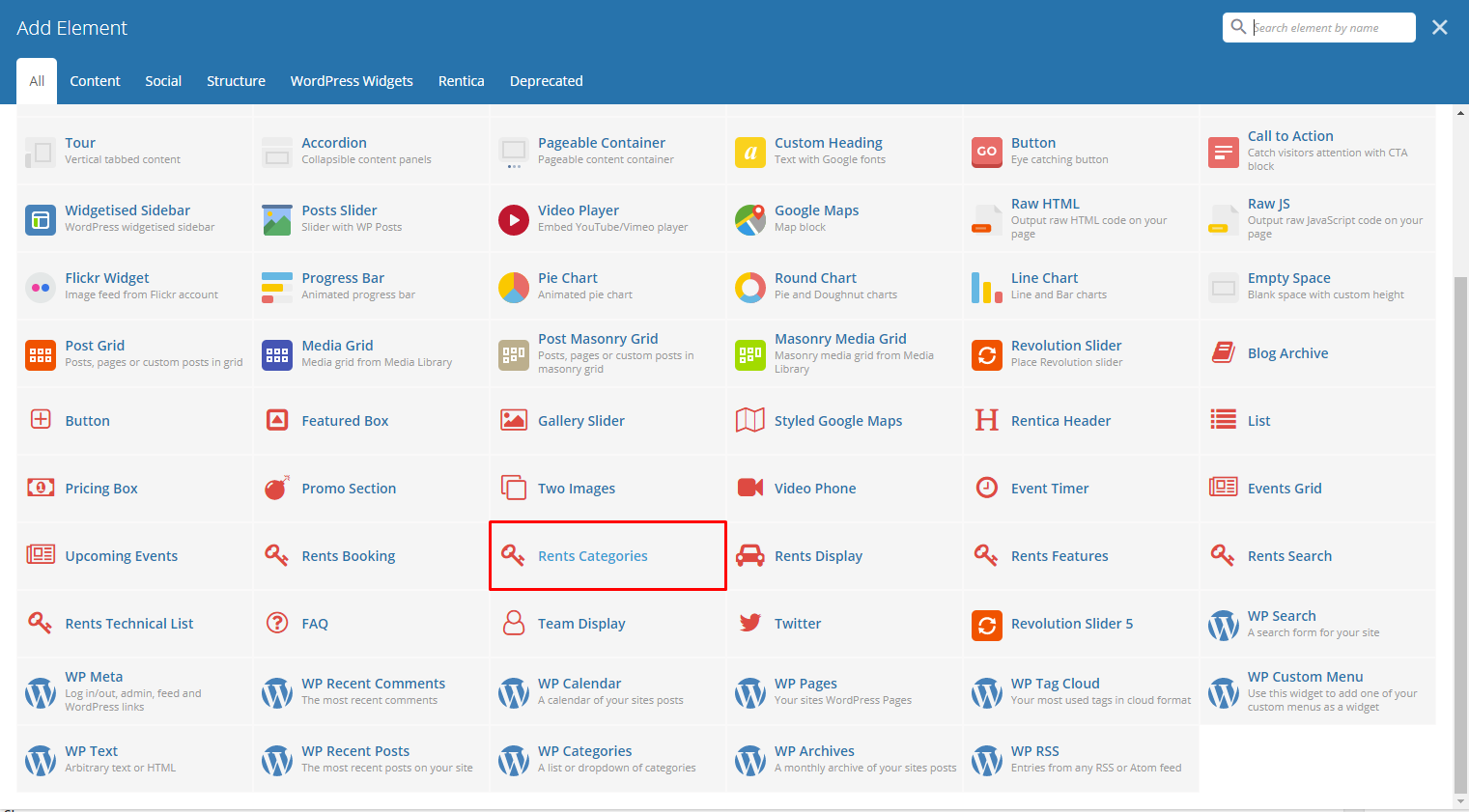
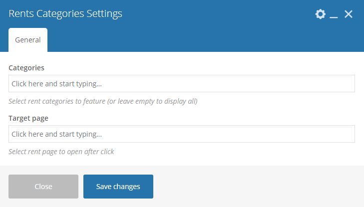
This element shows rents by categories.
|
-General Tab-
- Categories - Select rent categories to feature (or leave empty to display all).
- Target page - Select rent page to open after click.
Sample Rent Categories:

|
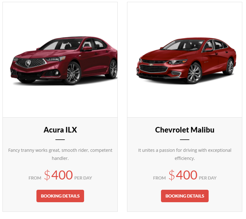
This element shows all the item in rent. You can filter the item to display by using the Filters tab.

|
-Filters Tab-
- Limit - Set results limit.
- Skip X elements - Skip a number of elements from the results.
- Order - How the posts order looks.
- Order by - How the posts are ordered.
- Specify Rents - Only selected Rents are shown.
- Exclude Rents - None of the selected Rents will be displayed.
- Specify Categories - Only show Rents under the categories.
- Exclude Categories - None of the Rents under the categories are shown.
- Specify post tags - Only show Rents with selected tags.
- Keyword search - Show Rents with certain keyword.
Sample Rent Display:
|
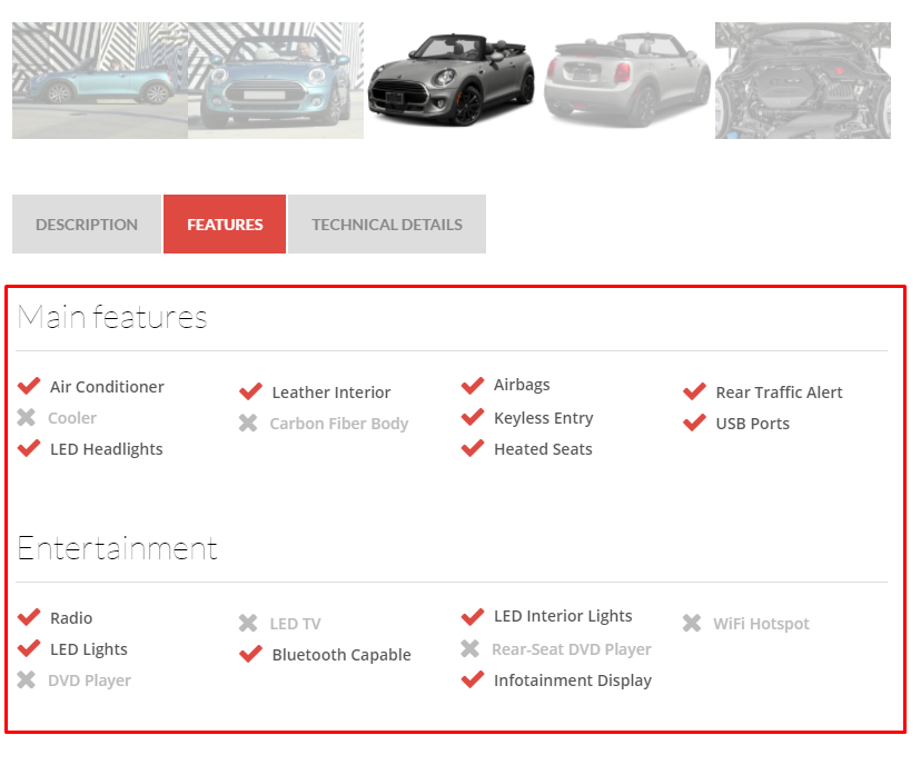
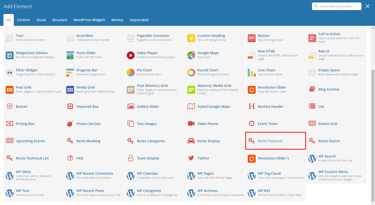
This element is used in Rents post type. The features that are added at Rents will be the ones that will be displayed.
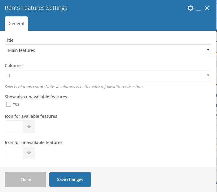
|
-General Tab-
- Title - Select the title of the features you would like to show. All the features that are added in that title will be displayed.
- Columns - Number of columns to divide the features in a rows. 4 columns is better with a fullwidth row/section.
- Show also unavailable features - Option to show the features that are not available as features.
- Icon for available features - The icon to show that the feature is available.
- Icon for unavailable features - The icon to show that the feature is not available.
Sample Rent Features:
|
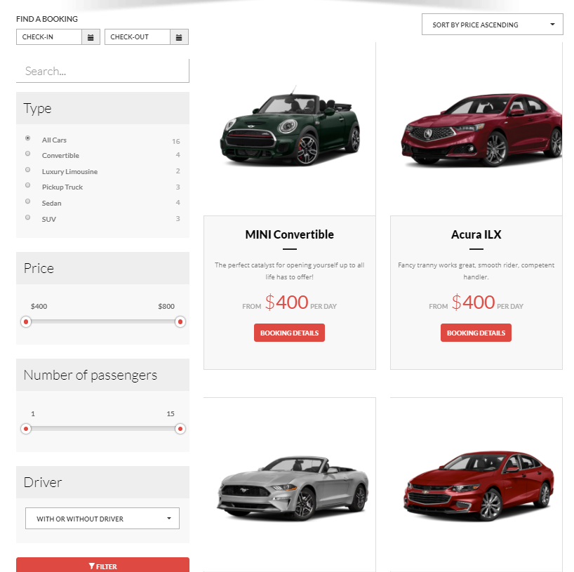
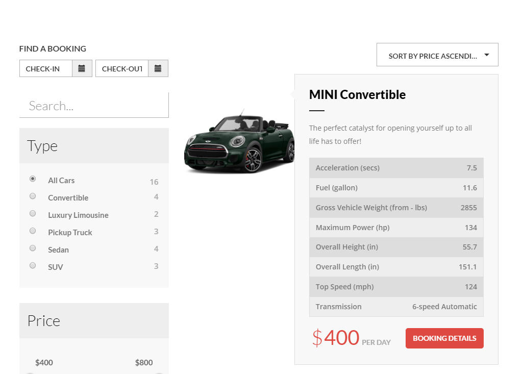
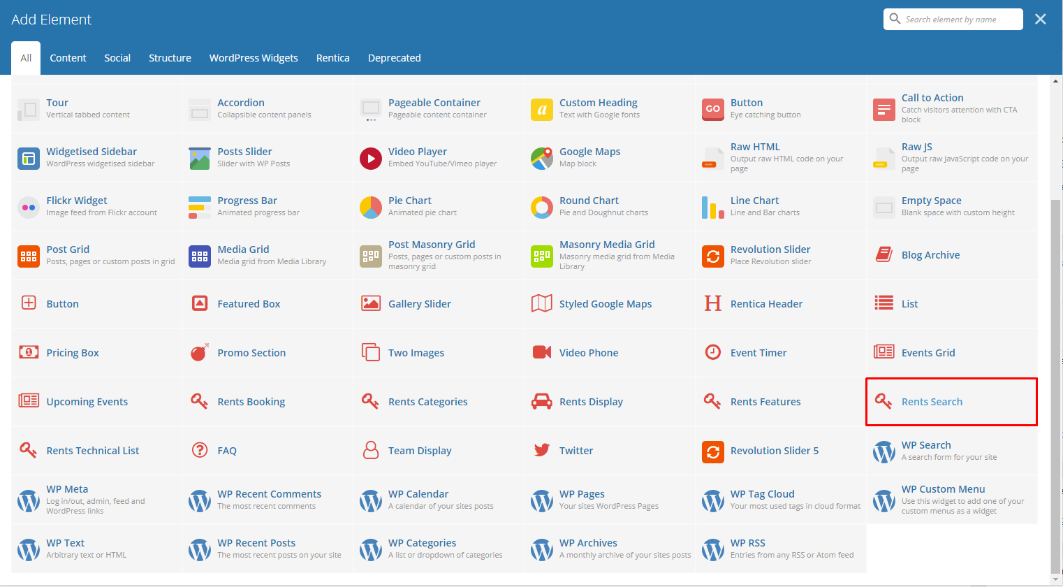
This element displays the items in Rents with a way to search the items and filter the prices.

|
-General Tab-
- Type - Select the type of display it will show in the site. There are 2 options: Simple or With technical list
Sample for Simple Rent Search display
Sample for With technical list Rent Search display
|
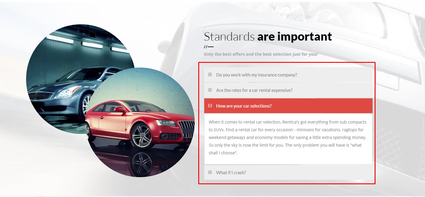
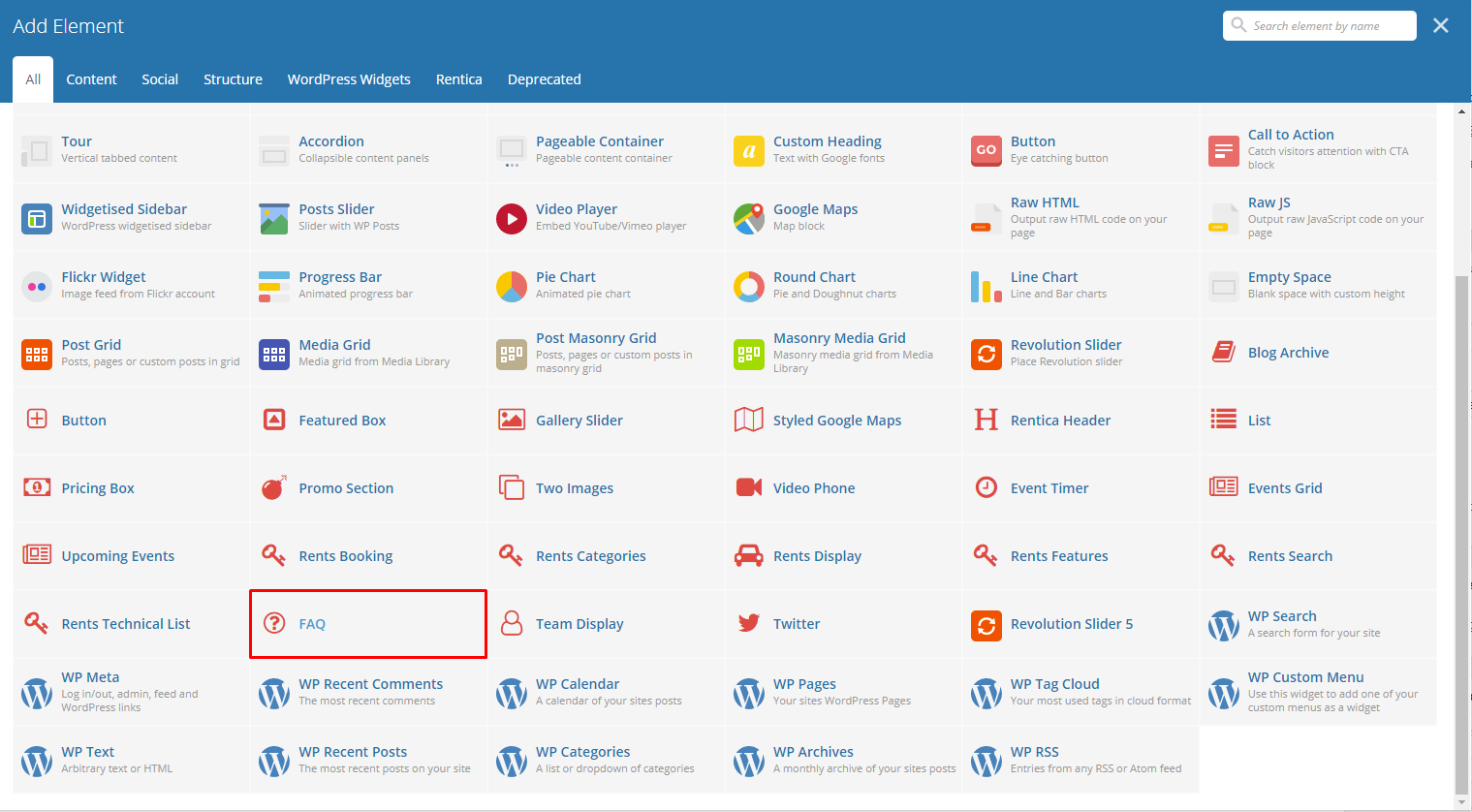
This element lets you add FAQs by category in the site.
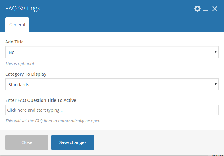
|
-General Tab-
- Add Title - Option to add a title/header above the FAQs.
- Category To Display - Category of the FAQs that you want to show.
- Enter FAQ Question Title To Active - The FAQ question that’s under the category set that is open/activated.
Sample FAQ:
|
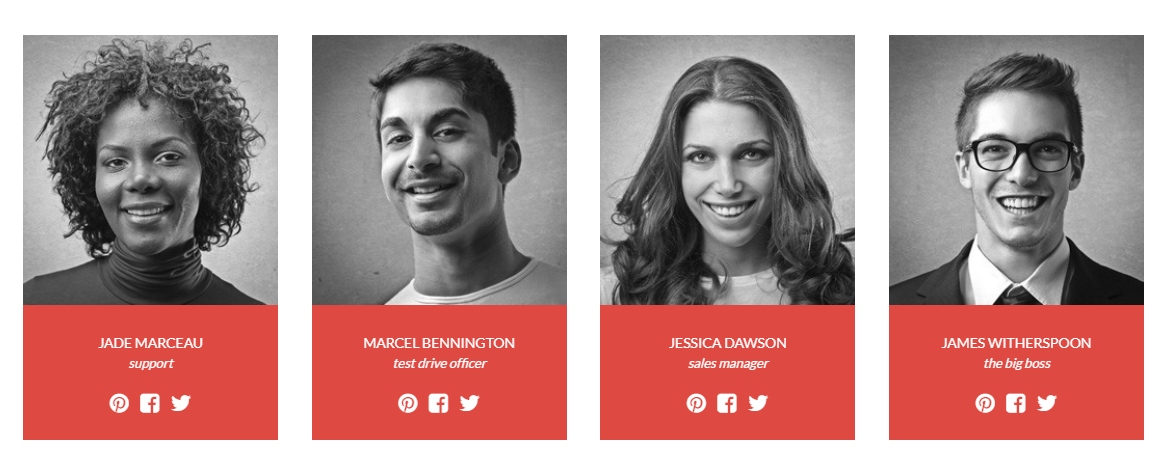
This element lets you show Team members items with their name ang position in a page.

|
-Filters Tab-
- Limit - Set results limit, use -1 to disable limit.
- Skip X elements - Skip a number of elements from the results.
- Order - How the team members order looks.
- Order by - How the team members are ordered.
- Specify Team members - Only selected team members are shown.
- Exclude Team members - None of the selected team members will be displayed.
- Specify Team Categories - Only show team members under the categories.
- Exclude Team Categories - None of the team members under the categories are shown.
- Specify post tags - Only show posts with selected tags.
- Keyword search - Show events with certain keyword.
Sample Team Display:
|
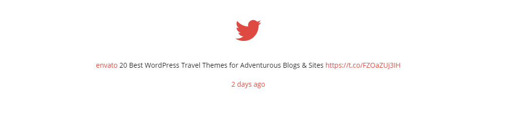
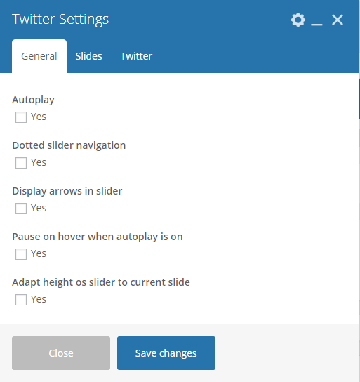
This element will let you connect to your twitter where all recent post will also be posted on your site. To get the information needed for the Twitter account, click on this link.
|
-General Tab-
- Autoplay - Option to make the slider move by itself.
- Dotted slider navigation - Option to show dotted slider navigation.
- Display arrows in slider - Option to show arrow slider navigation.
- Pause on hover when autoplay is on - Option to pause autoplay when the mouse pointer is hovering.
- Adapt height of slider to current slide - Option to adapt the height of the slider.
Slides Tab
- Slides to show - Number of slides to show.
- Slides to show on tablets - Number of slides to show on a tablet platform.
- Slides to show on phablets - Number of slides to show on a phablet platform.
- Slides to show on phones - Number of slides to show on a phone platform.
- Set initial slide - Set the initial slider that moves.
-Twitter Tab-
Note
The following information are from the Twitter account you created.
- Username - The twitter account’s username.
- Customer key - The customer key you set in your twitter account.
- Customer secret - The customer secret you set in your twitter account.
- Token - The access token that you got from twitter for your twitter account.
- Token secret - The token secret that you got from twitter for your twitter account.
- Limit - Limit of news to post.
- Parse url - You can display links from the content as plain text, short html links or full html links.
- Parse media - You can display media links from the content as plain text or 3 types of html links.
- Parse user id? - Display user @ids as plain text or links.
- Parse hashtag? - Display #hashtags as plain text or links.
- Embed images? - Option to show embedded images.
- Size of embeded images? - The size of the embedded images if option is yes.
- Tweet length limit - Max length of the tweet that will show.
- Cache results for X seconds - Cache Twitter feeds for better performance ex. 900 = 15 minutes. 0 - disabled.
Sample Twitter: